 Industry “best practice” for handling workflow with RAW and Jpeg images.
Having a clear framework for digital image production, editing and output is vital for photographers to be able to organise, archive and locate their images day to day, month to month and year to year. You don’t want to waste time doing basic image editing and admin tasks that could be automated in a simple and effective workflow that starts with downloading your photos from your camera…
Introduction - Digital image editing and cataloguing software
There are many software applications that are designed to help you organise, catalogue and edit your digital images. Some have professional spec image development tools whilst others are primarily intended for cataloguing and organising files and folders as a “photo library” or archive.
One of the most popular free applications is “Picasa” from Google which is free to download and includes basic image editing tools but is a powerful cataloguing application and organises your images into folders easily. Other applications are more powerful but also more expensive. Adobe Lightroom is fast becoming the industry standard application for many professional photographers and most of what follows is based on Lightroom…


Histograms.
White balance.
Colour balance.
Noise & Dust.
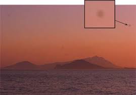 Once your photo is looking healthy and natural you will want to check it for noise and for dust marks. Noise is a product of high ISO values, small sized digital sensors and over or under exposure leading to loss of high light or shadow detail and speckling. Compact and “bridge” cameras always exhibit more noise than DSLR’s, Dx DSLR’s often show more noise than Fx or full frame DSLR’s. Most decent image editing programs have filters to allow you to attempt to hide or disguise any obvious signs of noise with a simple slider control. Another type of noise is “edge” or “colour” fringing which is seen as a coloured band or fringe along the edges of high-lights, often purple or blue in colour. Again, a good tool like Lightroom will detect these edges and allow you to dial them out with a slider control. Dust is a major problem on digital cameras, particularly DSLR’s where the sensor is more exposed during lens changing and so on. The only reliable way to spot dust marks is by examining your images at 100% scale on the monitor. You will see the dust marks as dark spots or splodges in areas of continuous light tone – typically the sky or areas of water. They don’t tend to show up in areas of dark detail so much. To get rid of them you should use the “healing” tool in your image editing software – occasionally the “clone” tool will be more appropriate – and if there are a lot of dust marks, clean your camera sensor with an approved swab and sensor cleaning product. However, do not be tempted to use canned compressed air – the propellant used in these products will ruin your sensor!
Lightroom has some powerful post production tools, like it’s ND Grad filters, dodge and burn tools, anti-red eye tool and so on. It also has a lot of creative “pre-set filters” for black and white, sepia or colour masking and it has other tools too. Thee are tools you use with discretion but it’s your choice when and how to use them. I find that I use the ND Grad tool all the time!
Here’s a landscape (Langdale Pikes) that I’ve been working on, using the ND Grad tool to really bring out the sky detail and create some extra shadow drama! I can also open the image in Photoshop, direct from Lightroom, complete with Lightroom changes applied, if I want to, in order to do re-touching work using layers which Lightroom doesn’t have. Lightroom and Photoshop work seamlessly in this way.
STEP 5: Ready to export
In Lightroom you don’t need to export your images to save them, they are already saved and can be closed when you have applied all the post production. However, at some stage you will want to send them to a printer, or email them or upload them to a website. This is when you will need to export…
Different destinations will have different requirements for outputting your photos. A publisher will need a different kind of file to a print house or photo-finishing lab and your ink jet printer will need something different again. Website and email applications need low res images at 72 ppi (dpi) whereas an ink jet will want something between 150 and 270 ppi. A publisher will want 300 ppi.
Dpi settings.
Pixel dimensions.
Colour space.
8 bit files.
In Lightroom, when I export my image files, I can select from pull-down menus all the parameters that I want for the files that I’ve selected to export. It doesn’t change the image file in any way. It just applies these parameters to a copy of the image file which it creates and exports with these changes and settings. The original files are untouched. I generally use the following settings to create a high res file for publishing:
8 bit, sRGB, 300dpi, 100% Jpeg, original size, with medium output sharpening applied, saved to a named folder in My Pictures or to another destination, complete with My Metadata, an image caption and full keywording.

If I’m exporting for email or web, I use 8bit, sRGB 72dpi, 50% Jpeg, with high sharpening for screen applied and saved to whatever folder I’ve specified.
Lightroom actually enables me to make any number of pre-sets for saving images to specific or regular destinations or target settings and I use this facility a lot.
Conclusion
By spending some time thinking though an efficient and thorough digital workflow, your time and energy will be well spent and your images will always arrive in the best possible state for publication. You will have a well referenced and accessible photo library and your editors will know that you can be relied on to produce professional work that doesn’t need loads of post production, captioning and key-wording at their end to be useable. The sooner you get organised the better!
Next Week: Week 13 How to complete the assignments!
There are many software applications that are designed to help you organise, catalogue and edit your digital images. Some have professional spec image development tools whilst others are primarily intended for cataloguing and organising files and folders as a “photo library” or archive.
One of the most popular free applications is “Picasa” from Google which is free to download and includes basic image editing tools but is a powerful cataloguing application and organises your images into folders easily. Other applications are more powerful but also more expensive. Adobe Lightroom is fast becoming the industry standard application for many professional photographers and most of what follows is based on Lightroom…
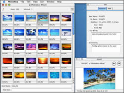
Pic 1. Photo-mechanic
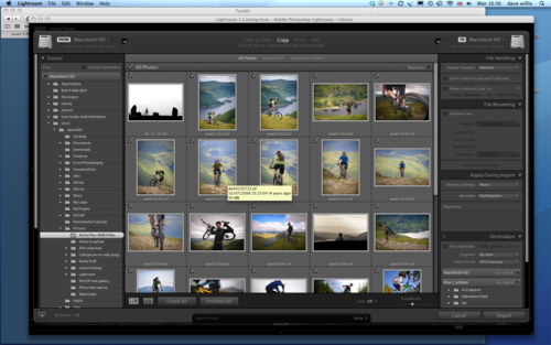
Pic 2. Adobe Lightroom
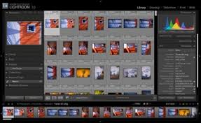
Pic 3. Adobe Photoshop Elements
STEP 1
Up-load your images from camera to computer
NOTE: It’s very common for camera manuals to recommend importing photos from the camera by using the supplied mini USB cable. There has been some suggestion that this is not a good idea. It can be a very slow way to import a lot of photos, using a dedicated card reader is normally much quicker and USB cables carry a power current which could harm your camera unless they are properly suppressed.
By using a decent image editing package like Apple’s Aperture, Adobe Lightroom, Photoshop (Elements or CS) or possibly even the OEM package that shipped with your camera, you can quickly edit, do fast post-production and do captioning and key-wording even as your images are being imported onto your computer.
I use (and recommend) Lightroom (the current version is v4). Because that is what I use, I’m going to base the rest of this conversation around my workflow in Lightroom. You may not have Lightroom and you may have a different approach to your workflow. That’s fine - whatever works for you is OK. I’m just going to outline my approach and you can take from it what you will.
So, This is how I do it:
The CF card gets plugged into a dedicated card reader connected to an iMac via USB cable. The import dialogue opens in Abode Lightroom as soon as a card is detected. The import dialogue allows many options to be chosen.
- Import to Hard Drives.
- Ideally you will have two external hard drives, mirror images of each other. Hard drives are cheap and robust and you can buy them easily in pairs. 750Gb to 1Tb capacity drives will be sufficient for most people. You can also set up a simple software program that copies any changes that occur on drive A to drive B so now you have a main external hard drive, safe from virus attack and corruption problems and a back-up hard drive that mirrors your main hard drive and provides a complete back-up of all your photos. Do not keep your photos on your main computer (they take up too much room and can get corrupted too easily) particularly if it’s a laptop – very easy to loose or have stolen! Incidentally, using cd or dvd as a backup is OK in the short term but unwise long-term as these discs have a shelf life and can become unreadable after as little as 3 or 4 years. Lightroom also gives me the option to create a complete back-up of the import on my C-drive just in case. I always use this and then delete the back-ups once a month or so when I’m confident I have everything safely stored and backed-up on my external drives.
- Specify a location and re-name your photos.
- Now is the time to decide where you are going to store your images. If you are organised you will have sorted out a file and folder system or date order system for storing your photos. If you have not and your images are being stored in a random order, scattered throughout your computer, you need to address this right now! You are building a photo “library” and it needs to be as organised as a book library otherwise, years from now you will struggle to find your photos when you need to. Specify where your photos will be imported to and re-name them with whatever file/folder naming convention that you are using.
Image developing options in the import dialogue.
If you shoot Jpeg images, the files should ideally come out of the camera ready to use and should not require very much in the way of image developing or post-production – that’s what Jpegs are designed for. However, if you shoot RAW then all of the image developing still needs to be done and often you can do most of this in one go as the images are being imported. A program like Lightroom allows you to use pre-set image developing settings that can be applied to all images as they are being imported, which means that you have only a few tweaks to make after the images are imported.
Once you have selected the source and the destination, given the destination folder an appropriate name if necessary, set the re-name files option if required, done the globalkeywords, global captions and global image processing that you want and you’ve appended any metadata files you’ve set up, your ready to hit the import button. But there’s nothing here that you can do wrong - if you make a mistake in Lightroom with just about any option, you can undo it or revise it at any time, which is why the software is so good to use.
So I now go ahead and hit Import Images. All my images should download from my memory card into the right file, in the right folder, with correct file names, keywords and captions, with metadata and with develop settings already done. That saves me a load of work later on.
STEP 2: Editing
If you have organised your workflow in this manner so far, you should have a straightforward job of editing now. You need to zip through each image and decide which are “keepers” and which are “trash”. Be ruthless and get rid of the failed images as fast as you can! Then you can concentrate on the images that are worthwhile.
When you have edited your collection down to the keepers, you can go through and tweak the developing. Each image will need to have its’ histogram examined and small exposure changes applied to maximize the tonal range or get the “look” that you want.
Lightroom gives me a number of options and ways of tagging or flagging images when I’m editing, so I can give them ratings or organise them into groups according to my needs. First I can flag them as picks, un-flagged or rejects. I start by just using pick (P) or reject (X). When I’ve been through the lot, I hit Cmd Delete and delete all the rejects (X’s) off my system. I’m pretty ruthless about this and once I’ve made the decision to mark a shot as rejected I almost never change my mind, hence the deletion. If I do decide I’ve made a mistake at a later date, all is not lost. I still have that backup of the original download on my C-drive that I can access to re-instate the image if I need to. Once I’ve deleted all the initial rejects, I go through the shoot again, this time with a more critical eye. I’m looking to downgrade as many of the images as possible to “un-flagged” status or find images that ought to be rejected but were missed first time around. What I should end up with is an elite collection of Pick images from the shoot and a whole bunch of un-flagged “nearly-but-not-quite” shots that will do for extra stock. What I hope is that I will have got rid of all the sub-standard stuff by now - never have to look at them again!
STEP 3: Post Production
Now it’s time to fine-tune just the picks. I don’t bother with the un-flagged shots until I have to actually use them.
Cropping.
It makes sense to take care of any cropping of the image first so you don’t waste time trying to do post production on areas of the image that are going to get cropped out. At the same time, you can do image rotation if the horizon or vertical lines need adjusting and if you have the tools (Lightroom does), you can also fix convergence or divergence.
- .
For most images that contain a range of tones from deep shadow to bright highlight, the histogram should be contained within the black point and the white point. In fact many photo-libraries will specify that images submitted to them should be contained within the tonal range of 2-254. What does that mean? Well, absolute black in a digital photo is described as tone 0 and there are 256 tones represented on a camera’s histogram, tone 256 is absolute white. Mid grey – midtone – is halfway between these two extremes at 128. Any tone that is darker than mid grey will have a value of between 128 and 0, whilst any tone lighter than mid tone will be 128 -256. If you produce a photo in which the histogram displays a range of tones that start at about 2 (almost black) and finish at about 254 (almost white), you will have captured very nearly the full range of tones possible without actually reducing your darkest tone to black or your lightest tone to white, which means you will havesome detail in the shadows and some detail in the highlights – and that’s what photo-libraries want. Of course, sometimes your photos will need to have black or white in them – a silhouette for example, will by definition contain lots of black – tone 0. But if your photo looks like it ought to contain a full range of tones, tweak the exposure controls to make your histogram fit between the black point and the white point. Over-running the black or white point is called “clipping” and is normally to be avoided.
Fixing exposure problems.
Fixing exposure problems.
Most exposure problems, errors in which the exposure has been slightly over or under cooked, can be fixed just using exposure, contrast, and colour balance controls and don’t require a lot of post-production work. Generally, the less you do the better and if you are shooting Jpegs you really don’t want to be pushing the digital image very far at all – doing so can very quickly result in a very degraded photo.
White balance.
Again Jpegs should have their white balance fixed in the camera at the point of shooting. Although Jpeg white balance can be fixed in Photoshop or similar using the colour balance controls, it requires a bit of fiddling and an understanding of how RGB and CMY colours work together. RAW files however can be white balanced very easily in any raw converter software with a simple slider control. It’s one of the reasons why RAW is preferred by photographers. White balance refers to how cameras treat colours under different coloured light sources. If you didn’t already know, daylight is “blue” light and is how we normally perceive colours – but household lights are tungsten and are orange in colour. Clearly, to a camera colours illuminated by blue light will look very different to colours illuminated by orange light, hence the need for white balance. Auto white balance controls on cameras usually work well, but not always, so when shooting Jpegs, be prepared to set manual white balance in the camera.
Colour balance.
Fixing colour balance is really about looking for colour casts that shouldn’t be there, or returning coloured areas to a more natural state. Greens and blues for example can acquire colour cast that make them look wrong; Greens ca sometimes look too yellow or magenta whilst blue skies can tend towards magenta or purple. Skin tones in portraits are worth looking out for as well – they can look too green or blue. Tweaking the colour saturation or better still the colour vibrance controls can help a lot.
Noise & Dust.
STEP 4: Fine tuning in post production
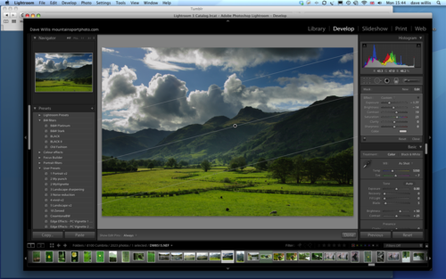
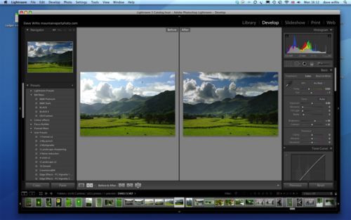
Lightroom has some powerful post production tools, like it’s ND Grad filters, dodge and burn tools, anti-red eye tool and so on. It also has a lot of creative “pre-set filters” for black and white, sepia or colour masking and it has other tools too. Thee are tools you use with discretion but it’s your choice when and how to use them. I find that I use the ND Grad tool all the time!
Here’s a landscape (Langdale Pikes) that I’ve been working on, using the ND Grad tool to really bring out the sky detail and create some extra shadow drama! I can also open the image in Photoshop, direct from Lightroom, complete with Lightroom changes applied, if I want to, in order to do re-touching work using layers which Lightroom doesn’t have. Lightroom and Photoshop work seamlessly in this way.
STEP 5: Ready to export
In Lightroom you don’t need to export your images to save them, they are already saved and can be closed when you have applied all the post production. However, at some stage you will want to send them to a printer, or email them or upload them to a website. This is when you will need to export…
Different destinations will have different requirements for outputting your photos. A publisher will need a different kind of file to a print house or photo-finishing lab and your ink jet printer will need something different again. Website and email applications need low res images at 72 ppi (dpi) whereas an ink jet will want something between 150 and 270 ppi. A publisher will want 300 ppi.
Sending your images to be published?
This is the spec you would output to for a magazine or publisher:
Jpeg (standard Jpeg, not Jpeg 2000)
300dpi (ppi)
specified pixel dimensions (eg “at least 2500 pixels on the long side”)
Specified file size (eg “between 1 and 1.5 mb compressed)
sRGB colour space (not Adobe RGB)
8 bit file (not 16 bit)
File format.
Just about everyone, except perhaps photo libraries, will want Jpeg files. They are universally readable by all computers, take up minimal file space because they are compressed and are easily emailed or sent via FTP or uploaded to web. You may come across Jpeg2000 – don’t use this – it’s a different coding method (actually superior to Jpeg) but requires decoding software and is not generally supported by website browsers. Jpegs can be compressed at a variety of quality settings. Most editors will want a good level of quality and ask for quality setting of High, 10 or above. This just means that the Jpeg won’t be compressed too much.
Dpi settings.
First we need to be clear about what dpi and ppi mean. Dpi isDots per Inch and refers to how many dots of ink per inch a printer needs to render an image at photographic quality. It has nothing to do with the quality or resolution of your photo. That is controlled by how many pixels you have in the image. So ppi is how many pixels per inch the printer will be printing onto paper. The more pixels you have, the more of them can be printed per inch, so the higher the quality of the print. So dpi and ppi tend to be used interchangeably. But they have nothing to do with the quality of your image. If you are changing/upsizing the dpi/ppi setting in your software, make sure you have “resample image” turned OFF, and if have a setting that says “maintain original size”, make sure this is checked ON otherwise the software will try to resize your image to meet these printing requirements and result in a very poor quality file. As a rule, just set your dpi/ppi settings to 300dpi for publication and 72 dpi for web use.
Pixel dimensions.
The quality of your photo is determined by the amount of pixels you have, amongst other things. A typical 6 megapixel DSLR like a Nikon D40 produces a file that is 2000 pxls by 3000pxls. If I want a print 10 inches wide I divide 2000 by 10 and get a figure of 200 pixels per inch of print and 3000 divided by 200 equals 15 so my print is 10 inches wide by 15 inches high at 200 ppi. This is perfect for a high quality print. So when an editor asks for a specific pixel dimension (say, 3500 pixels on the long edge) what he’s really saying is that if you send a file that contains that many pixels he can be sure he can make a print that is at least 15 inches wide and that’s big enough for anyone!
File Size.
File Size.
Often we are asked for specific file sizes or file sizes not exceeding a certain size. This is because either it won’t be accepted as email or it’s too big for the ftp client to handle or some other reason. It’s easy to compress Jpegs to fit a given file size, it just takes a couple of trial runs with different levels of compression to check the compressed file size meets the requirement. A 12 megapix camera will make a 28mb jpeg which will produce an 8mb file when compressed at maximum quality setting 10 or 12. Reduce the compression to 35% and you get 1.5mb file, which will still open to a 28mb file when full sized.
Colour space.
There are a number of “colour spaces” that a digital file can be saved in but typically we only talk about two of them – AdobeRGB and sRGB. From the point of view of publishing images, set your camera to sRGB and export your images as sRGB. Don’t use Adobe RGB unless you really have a good reason for doing so. AdobeRGB files print very flat and dull, sRGB files print much better, full of contrast and colour. It’s also harder for a printer to muck up your colours in sRGB!
8 bit files.
Most RAW digital files come out of the camera as 12 bit files but are can be processed as 16 bit files. However, when you convert them back to 8 bit files you halve the file size – which is good! Only send 8 bit files, there’s no benefit in doing otherwise, unless you are sending files to a graphic designer who is going to do a lot of post-production with them. Jpegs are already 8 bit.
In Lightroom, when I export my image files, I can select from pull-down menus all the parameters that I want for the files that I’ve selected to export. It doesn’t change the image file in any way. It just applies these parameters to a copy of the image file which it creates and exports with these changes and settings. The original files are untouched. I generally use the following settings to create a high res file for publishing:
8 bit, sRGB, 300dpi, 100% Jpeg, original size, with medium output sharpening applied, saved to a named folder in My Pictures or to another destination, complete with My Metadata, an image caption and full keywording.
If I’m exporting for email or web, I use 8bit, sRGB 72dpi, 50% Jpeg, with high sharpening for screen applied and saved to whatever folder I’ve specified.
Lightroom actually enables me to make any number of pre-sets for saving images to specific or regular destinations or target settings and I use this facility a lot.
STEP 6: Alternative ways or delivering an image
On Disc – cd or dvd
Via FTP
Email
Web client (Photoshelter)
On Disc – cd or dvd
Via FTP
Web client (Photoshelter)
Delivering images to an editor or publisher, at speed to meet deadlines, can be made very simple. Here’s some solutions.
Burning the image files onto disc.
This is universal and easy to do. But there’s a couple of things to point out. Some disc drives don’t like cd’s, some don’t like dvd’s and the quality of discs can be variable. Just because you can read the files on a disc doesn’t mean the client at the other end can. So use good quality discs. You should always include a file that contains your contact and copyright information and always label your discs clearly with your name and contact details because discs are easily misplaced, lost, left lying around in offices and generally misused! I never send images on disc if I can help it!
FTP.
This is better. It’s quick, efficient and safe if the client has a dedicated ftp server. You can use free ftp clients like Mozilla’s “Filezilla” which is a free download or if you use Mac as I do, use Fetch which is excellent. You can also use third party ftp websites like “yousendit” and “mailbigfile” – they work very well.
Email.
If you can email the client your images then great! It’s easy and safe and costs you nothing.
Web client.
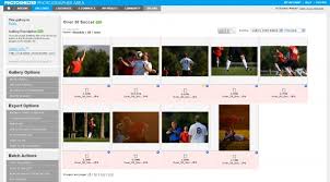
This is what I use. I have a Photoshelter account that allows me to upload large numbers of images, make galleries and invite clients to view the galleries. It allows them to download the images they want from the galleries, which I can monitor and track and if I want to I can have them pay on-line for the images via Paypal. They can download low res images to use in lay-outs and request images that are not on view. So for me and a growing number of professional photographers around the world, web clients like this offer a complete, safe and efficient solution. It’s probably fair to say that it’s aimed at high-usage and won’t suit writers who only occasionally send image files – but my clients and editors seem to like it and find it very handy.
Conclusion
By spending some time thinking though an efficient and thorough digital workflow, your time and energy will be well spent and your images will always arrive in the best possible state for publication. You will have a well referenced and accessible photo library and your editors will know that you can be relied on to produce professional work that doesn’t need loads of post production, captioning and key-wording at their end to be useable. The sooner you get organised the better!
Next Week: Week 13 How to complete the assignments!
No comments:
Post a Comment